Using Elements in the Setting to Complement Colors and Style
As a photographer, I've always been drawn to the interplay between elements in a setting and how they interact with the colors and style of a photograph. Every wedding or session presents an opportunity to create visual harmony by carefully selecting and positioning elements within the frame, paired with the setting to create stunning and cohesive compositions. I’ve had this topic on my list to share about for a while because I love it so much and wanted to share a little bit of how my crazy mind and eyes work.
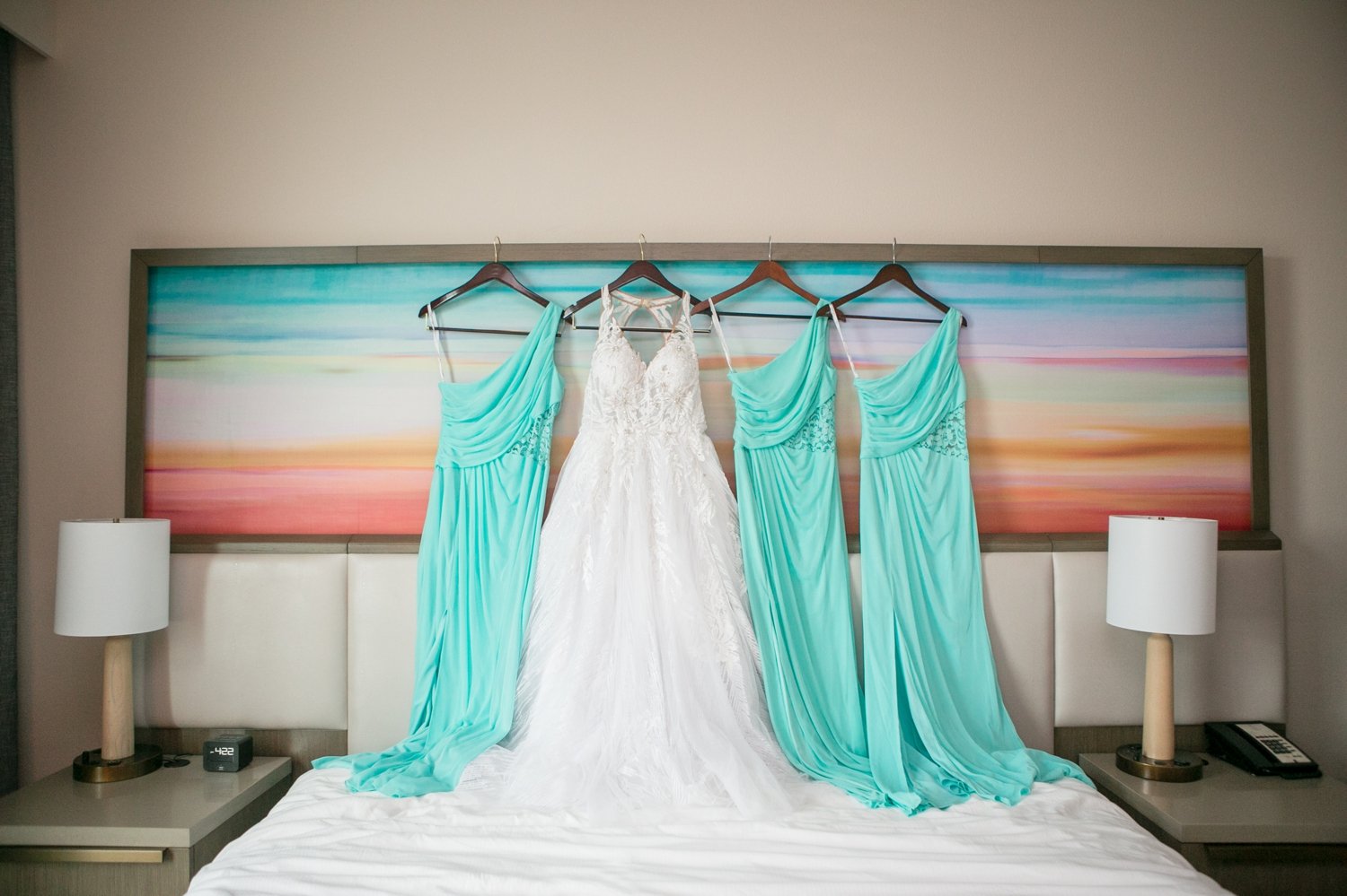
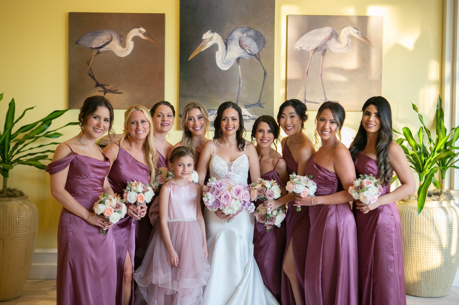
Color is a fundamental element in photography, and it plays a pivotal role in setting the mood and tone. A lot of times what my eye is drawn to happens totally by chance because I’m looking for it. I LOVE this artwork in the hotel where Michelle and her bridesmaids got ready. This king size wall art happened to be hanging above the bed and literally was the exact color scheme of her wedding. I could not have planned it better myself!!
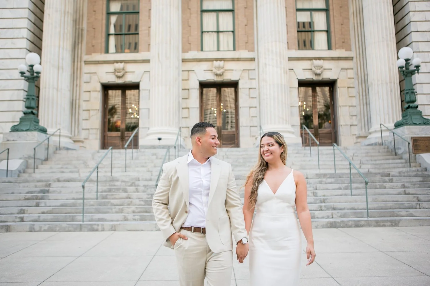
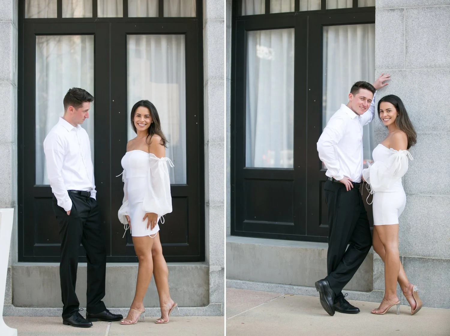
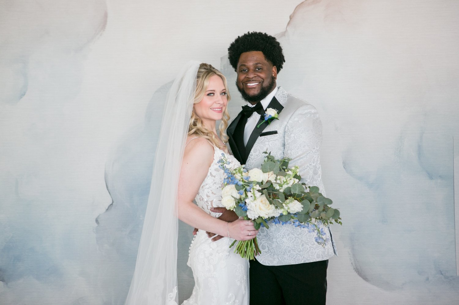
Sometimes, simplicity is key. In monochromatic settings, where various shades of a single color dominate, focus on textures, patterns, and lighting to add depth and interest. When Maria and Wilmy told me they wanted a simply and classy session that was very light and neutral in color I paired their attire idea with the marble of Le Meridien which is very similar in style and feel. Mckenzie and Cullen’s was also Monochromatic but totally different as they wanted more of a black and white feel and these doors matched perfectly. There are also many different “lines” in there between all the lines in the steps, pillars, and marble or the lines in the doors and curtains all of them are important in the composition behind the people.
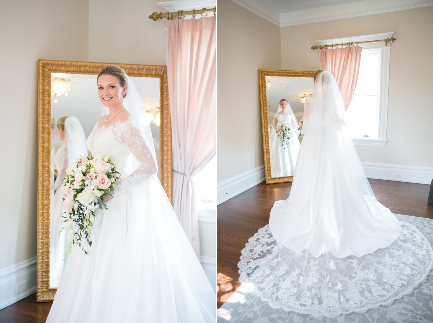
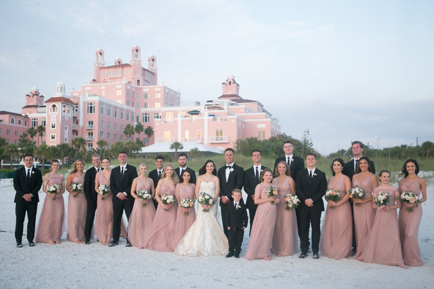
Wherever I am, I am always “looking” to capture my client’s personality and love for each other along with using the scene to bring that out even more. Whether it’s blush curtains that match Kate’s bouquet, the Don Cesar in the background that was the same color as Lauren’s bridesmaids dresses (that was planned:-), or using artwork like at the Sand Pearl or wallpaper at the Grand Hyatt. It’s interesting because usually it’s not planned and kind of happens organically as I’m scoping out the locations and lighting I want to use.
This skill is one that is kind of hard to put into words but I think is one that we as seasoned photographers always do without even realizing it, I know I didn’t really even realize how I am always doing this until renovating our house. I was designing everything to be available to be a pretty background in case it where in a photograph and I was like, hmmm legit this is a skill that I’ve definitely honed over the last almost 15 years!

